Cantor Arts Center
328 Lomita Drive at Museum Way
Stanford, CA 94305-5060
Phone: 650-723-4177

Allen Ruppersberg (American, born in 1944), Poster Objects (The Color of Perfection is Pink), 1988. Screenprints on aluminum. Gift of the Marmor Foundation (Drs. Michael and Jane Marmor) from the collection of Drs. Judd and Katherine Marmor.
Art/Object considers contemporary works in the collections of the Cantor Arts Center and Bowes Library that fall between the cracks of obvious medium categories. These editions, posters, placards, invitations, and preparatory documents point to the way an artist’s practice often flows across media, with ideas or aesthetics explored through a variety of formats. The virtual exhibition includes works by artists including Eleanor Antin, Andy Goldsworthy, the Guerrilla Girls, Alison Knowles, Jacob Lawrence, Allen Ruppersberg, Ed Ruscha, Kara Walker, Andy Warhol, and Lawrence Weiner, among others.
In 1977, Lawrence Weiner created an invitation for Having been marked with (i.e. decorated), having been decorated with (i.e. marked), with a probability of being seen, his upcoming exhibition at Konrad Fischer Gallery. Its unwieldy title is typical of Weiner’s work, which uses language as a material to construct imagery in the mind of the viewer, and organizationally it is divided into three labels: one in English, one in German, and one with a combination of the two languages. One copy of the invitation is now in the collection of Bowes Library at Stanford University, marking it as an object worth saving. But to a recipient of the invitation in 1977, this decision wouldn’t have been as clear-cut. Is the invitation a work of art, an archival document, or junk mail destined for the wastebin? When considering an object such as an invitation, this determination often depends upon how much time has passed since the item was mailed, the artist’s historical recognition, and the judgment of the person doing the sorting, among many other subjective or indefinite factors.
Art/Object considers works in the collections of the Cantor Arts Center and Bowes Library that raise such tricky issues of classification and preservation. This exhibition grew out of my research on ephemera, a fuzzy and shifting category described by media scholar Mary Desjardins as “throwaways not thrown away.” The artworks in this show raise similar questions of definition, encompassing editions, certificates, posters and placards, invitations, postcards, and preparatory documents: things that fall between the cracks of obvious medium categories. They point to the way an artist’s practice often flows across media, with ideas or aesthetics explored through a variety of formats without regard for the hierarchies and category divisions of critics and collecting institutions.
In the 1960s and 1970s, artists increasingly created time-based performances, instructions and event scores, and language-based constructions. The materials for these works were intentionally inexpensive, designed to disappear or otherwise complicate the division between the supposedly rarified world of art and the actions, sounds, and sights of daily life. While artists have long used media from popular culture and modern city life—Pablo Picasso’s and Georges Braque’s collages incorporating excerpts of newspaper headlines come to mind—Conceptual and performance artists from the Vietnam War era heightened this practice, making works that were difficult to preserve or categorize according to the conventional definitions of museums and art history. The transience and nebulous medium status of new art objects were key to their democratic potential, since a deck of cards or a typed notecard could be circulated widely due to their reproducibility and low cost, in a way that a monumental painting could not.
In the decades that followed, artworks that blurred the boundaries between media became increasingly common, but questions of labeling and sorting lingered. Classifying an invitation, to return to the earlier example, as a print versus an archival document is no small decision, since the categorical schemas imposed by archives, libraries, and museums speak to the values of these particular institutions. And on a more practical level, these medium labels affect the ways in which objects are displayed, their availability to scholars and the public, and the frequency (or infrequency) with which they are exhibited, thereby shaping the audience’s view of artistic developments of the recent past.
This online exhibition invites you to contemplate the fluidity of artistic practice through four thematic sections: images across objects, the artist’s hand, supplements, and everyday things made anew. It features several videos of objects being handled and manipulated, allowing you to better understand their scale and tactility. The items presented here have an obvious usefulness that more straightforward paintings or sculptures lack. They serve purposes of documentation (as in a certificate of authenticity and a capstone), play (playing cards and a pop-up book), and communication (a postcard and several posters), charting the blurred boundaries between artworks and everyday objects.
Museums and archives often catalog works by a single artist by medium or purpose, separating, for example, sketches and photographic negatives from finished works, or promotional objects from artworks. These practical processes often create a hierarchy, with polished, recognizable media on top and preparatory items or advertising documents at the bottom. But artists typically explore imagery, compositional strategies, and thematic concerns across media. For example, Frank Stella used curving belts of color in drawings, prints, posters, and sculptures, modifying their appearance based on shifting references, spatial limitations, and contexts. By considering objects produced by a single artist across medium categories in this way, we can gain a richer understanding of the artist’s holistic production and creative process. Rather than presenting a hierarchy divided by media, the pairings in this section present an artist’s production as a continuum that unfolds organically across forms.
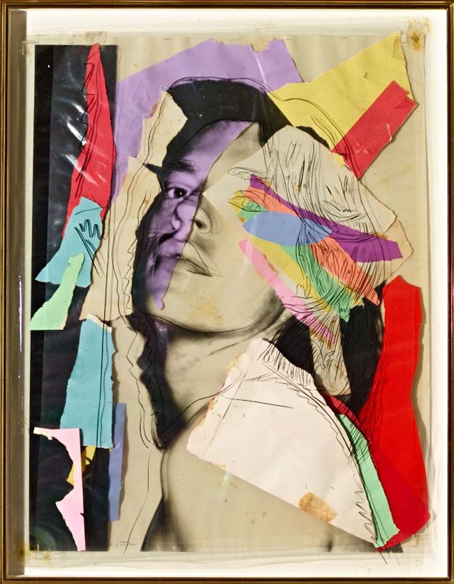
Andy Warhol (American, 1928–1987), Portrait of Mick Jagger, 1976. Mylar, paper, and crayon. © 2021 The Andy Warhol Foundation for the Visual Arts, Inc. / Licensed by Artists Rights Society (ARS), New York. Given in honor of Gerhard Casper, President, Stanford University (1992–2000), by Daryl and John Lillie, 2000.104
Andy Warhol (American, 1928–1987), Contact Sheet [Montauk: Andy Warhol, Jed Johnson, Mick Jagger, Jade Jagger, dachshunds Archie and Amos], 1976. Gelatin silver print. © The Andy Warhol Foundation for the Visual Arts, Inc. Gift of The Andy Warhol Foundation for the Visual Arts, Inc., 2014.43.3016
![Andy Warhol (American, 1928–1987), Contact Sheet [Montauk: Andy Warhol, Jed Johnson, Mick Jagger, Jade Jagger, dachshunds Archie and Amos], 1976. Gelatin silver print. © The Andy Warhol Foundation for the Visual Arts, Inc. Gift of The Andy Warhol Foundation for the Visual Arts, Inc., 2014.43.3016 A contact sheet from Andy Warhol](/sites/default/files/styles/width_constrained_md/public/images/2021-09/2014433016-wp-research-650w.jpg?itok=_5e5sZV4)
Andy Warhol met Mick Jagger at a party in New York in 1964, during the Rolling Stones’ first US tour. Jagger and his then-wife Bianca went on to become members of Warhol’s glamorous stable of friends, and in 1971 the artist designed the provocative cover of the Stones’ album Sticky Fingers, which featured a high-contrast close-up of a jeans-clad crotch, complete with a working zipper. This 1976 contact sheet by Warhol, one of 3,600 in the Cantor’s collection, shows Jagger and his daughter Jade on the beach in Montauk, along with Warhol’s boyfriend, Jed Johnson, and their dachshunds, Archie and Amos. Portrait of Mick Jagger, made the same year, pictures Jagger in a far less casual manner: here he appears like an icon, his famous face rendered in layers of shimmering Mylar and paper. While the contact sheet provides glimpses of Warhol and Jagger’s private, informal interactions, the collage portrait is a highly polished, outward-facing presentation, filtering Jagger’s body and gestures through Warhol’s distinctive visual style.
The photograph used in this collage was likely taken during the 1975 photo session that resulted in the ten-screenprint portfolio Mick Jagger. In order to create multicolored screenprints, each color must be inked through a separate screen in order to avoid bleeding and blurring; because the screens are inked directly onto the same surface, the final result of this elaborate process appears as a flat, single image. Artists sometimes use sheets of Mylar to work out the composition of various color layers before they are finalized. It is unclear if Warhol created this collage from preparatory sheets of Mylar or if he always envisioned it as a finalized work, but the use of this typically disposable material physicalizes the printing layers in an unusual fashion. The Mylar makes the printing layers evident, separating the black line drawing on the top from the photographic image on the bottom, with colored paper shapes interspersed in between.
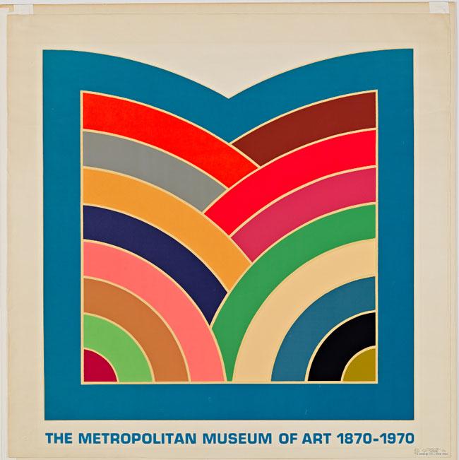
Frank Stella (American, born in 1936), A Poster, 1970. Color lithograph. © 2021 Frank Stella / Artists Rights Society (ARS), New York. Gift of Norman A. Strouse, 1975.51
Frank Stella (American, born in 1936), Sinjerli Variation III, 1977. Lithograph and screenprint. © 2021 Frank Stella / Artists Rights Society (ARS), New York. Given in honor of Gerhard Casper, President, Stanford University (1992–2000), by Larry Horton, 2000.153
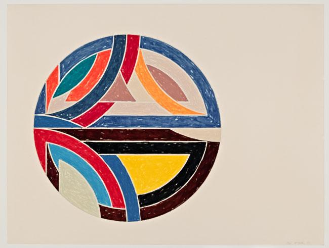
Though these works were produced seven years apart, they exhibit the hallmarks of Frank Stella’s signature style: interlocking or layered shapes filled in with thick bands of bold color. A Poster was created for a specific promotional purpose: to celebrate the centennial of the Metropolitan Museum of Art in New York. Accordingly, its central shape follows the contour of a blocky M. Sinjerli Variation III, based on Sinjerli I from Stella’s Protractor paintings (1967–70), has a more obscure origin. Sinjerli was a Hittite city, now an archaeological site in modern-day Turkey, surrounded by circular walls; in this print, the half-moon shapes of two protractors combine to mimic the shape of the city as seen from above. While the color bands in A Poster are smooth and perfectly monochromatic, those in Sinjerli Variation III are rendered in a scribbled fashion, a deceptively simple effect that was created through three printing stages. The variations across A Poster and Sinjerli Variation III reveal Stella’s diverse experiments in source material, coloration, and printing techniques, even as his core imagery remained consistent and recognizable.
Edward Ruscha (American, born in 1937), Documenta 5, 1972. Screenprint. Gift of Jerome Zipkin, 1982.184
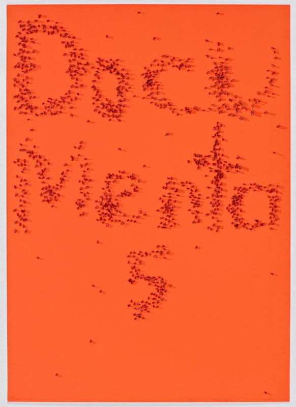
Edward Ruscha (American, born in 1937), Swarm of Red Ants, 1972. Screenprint. Gift of Jerome Zipkin, 1982.183
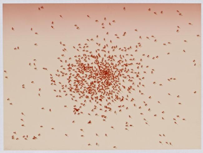
Inspired by the German Surrealist J. T. Baargeld’s ink drawing of beetles, which Ed Ruscha described as picturing “some kind of fantasy racetrack” for the titular animals, the artist conceived of six aerial views of bugs for the portfolio Insects, which included Swarm of Red Ants. Later that same year, the Swiss curator Harald Szeemann invited Ruscha to design the poster and catalogue cover for the fifth iteration of the Documenta art exhibition. Ruscha’s promotional materials drew on similar visual motifs as the Insects portfolio, with ants used to spell out the name of the show. Seen together, Swarm of Red Ants and the Documenta 5 poster contain comparable clusters of rust-colored ants, but their media and contexts lead to different interpretations: the print, like the other works in Insects, arranges bugs in aesthetically intriguing formations with no evident narrative, while the poster’s use of insect bodies recalls the swarming movements of artists, dealers, and curators as they traverse the international art circuit.
You've reached the end of the Images Across Objects section.
Continue ahead to look at the next section of this exhibition or click the button below to explore a different section.
These pieces feature material markers of the artist’s touch: scrawled signatures in pen, scribbled sentences in pencil, and brushstrokes in paint. They include a signed rock that acts as a commemorative marker of an outdoor installation, a drawing related to a performance, and a preparatory work in gouache and tempera, designed for wide reproduction in the form of a poster. In their unsettled status as mementos and sketches, these works bear traces of their creators’ intentions and physical presence.
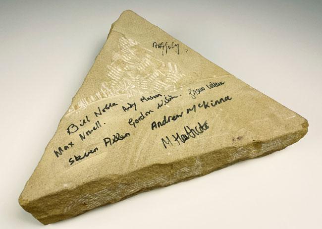
Andy Goldsworthy (English, born in 1956), Triangular stone signed by Andy Goldsworthy to commemorate "Stone River", 2001. Sandstone, permanent marker. Stanford Museum Collections, TP.1695
Andy Goldsworthy (English, born in 1956), Stone River, 2001. Sandstone. Given in honor of Gerhard Casper, President, Stanford University (1992–2000), for his vision and commitment to making the arts an integral component of university life, by the Robert and Ruth Halperin Foundation, 2001.46

Andy Goldsworthy creates outdoor works that mingle with the landscape, including Stone River, an undulating ribbon of sandstone installed near the parking lot of the Cantor Arts Center. To mark the completion of each of his projects, Goldsworthy and his assistants sign a piece of the building material as a commemorative marker. In the case of Stone River, this material was a rough, triangular block of sandstone. The stone functions like a capstone or certificate, preserving the names of the laborers whose skill enabled the installation of a complex sculptural work. It was accessioned to the Cantor collection several years after the 2001 completion of the outdoor work, indicating that its status as art was not immediately evident to museum staff.
From the 1970s through the 1990s, Eleanor Antin created a variety of artistic alter egos and documented their actions and appearances in photographs, films, and performances. This work on paper contains a sketch related to one such performance, Before the Revolution (1979), which featured “Eleanora Antinova,” a fictional Black ballerina in the Ballets Russes company and one of Antin’s personae, in the role of Marie Antoinette. This large drawing pictures an elegant stage set floating in a field of negative space punctuated by penciled musings about the preordained nature of life’s performances, such as, “it was as though she was acting in a play someone else had written.” These phrases seem to relate to the themes of identity and predestination in the final version of Before the Revolution, demonstrating how Antin worked out the visuals and concepts of her performances through preparatory media such as drawings. Detached from the nesting-doll layers of characters and the specter of blackface (Antin has engaged a Black actress to embody the Antinova character in subsequent enactments), the drawing stands as a separated, and less evidently problematic, element of an ephemeral performance.
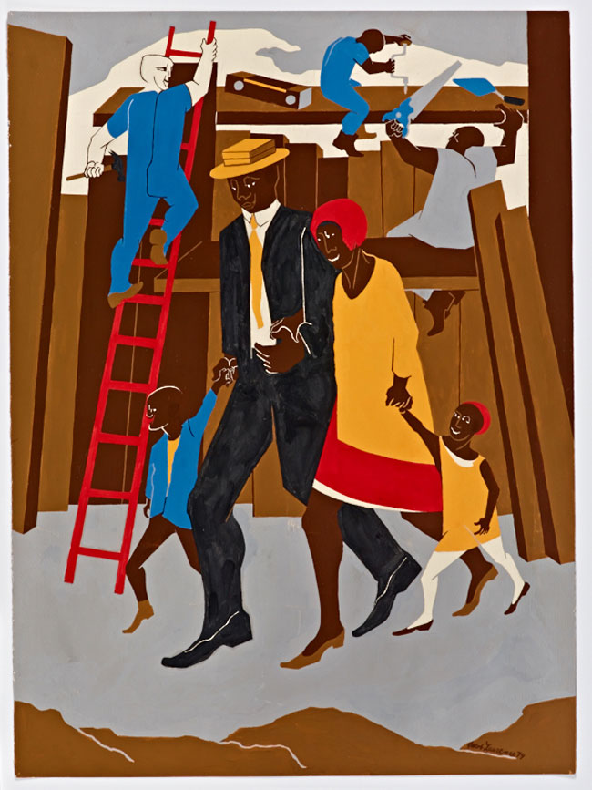
Jacob Lawrence (American, 1917–2000), Poster Design, Whitney Exhibition, 1974. Gouache, tempera, and graphite on paper. © 2021 The Jacob and Gwendolyn Knight Lawrence Foundation, Seattle / Artists Rights Society (ARS), New York. Gift of Dr. Herbert J. Kayden and Family in memory of Dr. Gabrielle H. Reem, 2013.104
For the poster advertising his 1974 exhibition at the Whitney Museum of American Art in New York, the painter Jacob Lawrence chose to create a new work rather than feature an existing painting or drawing. The resulting composition, later titled The Builders, succinctly combines his frequent themes of family, labor, and city life in Harlem, and is rendered in the rich primary colors and browns typical of his work. It is a striking summation of his artistic production, as befitting an image that promoted a retrospective exhibition. This work on paper was reproduced to cover almost the entire space of the finished poster, with sans-serif text in unobtrusive gray added at the bottom to convey the name, place, and dates of the show. The study conveys a greater sense of Lawrence’s gestures and the grain of his materials, especially the textured dark suit of the central figure, which was flattened and smoothed in the color serigraph printing technique used to produce the poster reproduction.
You've reached the end of The Artist's Hand section.
Continue ahead to look at the next section of this exhibition or click the button below to explore a different section.
This section features works on paper that serve as supplements to other artworks and events, such as a sculptural installation, a long-passed gallery show, and protest actions. Although they document, authenticate, or promote works or happenings that exist elsewhere in space and time, they exhibit a sense of visual pleasure and ingenuity all their own.
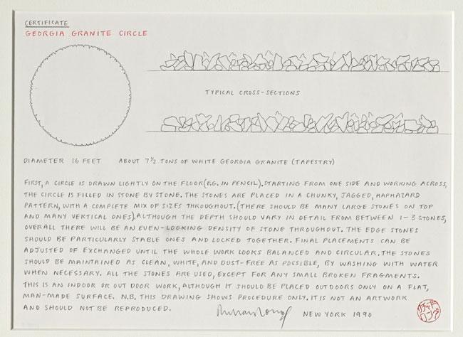
Richard Long (English, born in 1945), Certificate for "Georgia Granite Circle", 1990. Pencil on paper. © 2021 Richard Long. All Rights Reserved, DACS, London / ARS, NY. Gift of Rita and Toby Schreiber, 2004.7
Richard Long (English, born in 1945), Georgia Granite Circle, 1990. Marble. © 2021 Richard Long. All Rights Reserved, DACS, London / ARS, NY. Gift of Rita and Toby Schreiber, 2003.48
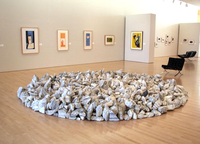
Richard Long creates large-scale sculptures and installations using natural materials; these sculptures are often integrated into the landscape, or designed to be moved and reassembled over time. Due to the transportable nature of the works, purchasers receive a certificate of authenticity with instructions for proper installation. The certificate for Georgia Granite Circle, which is in the Cantor’s collection (though not currently on view), provides detailed directions about how to install the titular work, a circular arrangement of white and gray stones. Long emphatically positioned the certificate as a procedural document and appendage to the installation, rather than an artwork in its own right. However, the certificate is categorized as a drawing within the Cantor’s internal cataloguing system, reflecting the way it was created and its connection to the artist’s hand. There is an intimacy and delicacy to the hand-drawn certificate, with its careful lettering and detailed rendering of the “cross section” of the stone arrangement, that contrasts with the rugged materials and bold scale of the sculptural work.
The Conceptual artist Lawrence Weiner produces works that come in the form of written statements, as embodied by the text on this invitation. They can either be physically built or communicated to viewers (or “receivers”) in the form of open-ended language. The oblique, conditional title of Weiner’s 1977 installation at Konrad Fischer Gallery in Düsseldorf—Having been marked with (i.e. decorated), having been decorated with (i.e. marked), with a probability of being seen—may provoke different associations and imagery in the minds of each receiver. In line with Weiner’s interest in translation and reading, the invitation is composed of three labels: the first contains the title in English, the second conveys the same title in German, and the third includes venue and date information in both languages. It intertwines functionality and artistic expression, combining practical communication with Weiner’s interest in the portability of words and concepts.
The Guerrilla Girls are an anonymous collective of female artists, founded in 1985, that advocates for greater representation of women and people of color in the art world. The group is best known for wheat-pasting bold, text-heavy posters in downtown Manhattan, using humor to spotlight galleries, museums, and publications that maintain a power structure favoring white, male artists. When protesting in person, members don gorilla masks to preserve their anonymity. A cheeky, portable version of the mask was produced in paper and foam core in association with preparations for two 2016 exhibitions in London, The Guerrilla Girls’ Complaints Department at Tate Modern and Is It Still Even Worse in Europe? at Whitechapel Gallery. Paper gorilla masks were also produced by the Guerrilla Girls West, an unconnected Bay Area faction that “appropriated” the name of the original group, according to Guerrilla Girl “Käthe Kollwitz.” The existence of the two masks, with their divergent designs, encapsulates debates around authenticity and “official” design in various activist groups. The scale, reproducibility, and low-cost materials of such objects enhance their ability to be circulated, altered, and adopted, changing in purported authorship or purpose as they move through the world.
You've reached the end of the Supplements section.
Continue ahead to look at the next section of this exhibition or click the button below to explore a different section.
In our quotidian habits and movements, we continually interact with carefully and cleverly designed items, from road signs to book jackets. The works in this section reimagine such everyday objects through artistic intervention, altering their normal purposes and appearances. Many are tactile, inviting viewers to turn pages, shuffle cards, or flip a postcard from front to back.
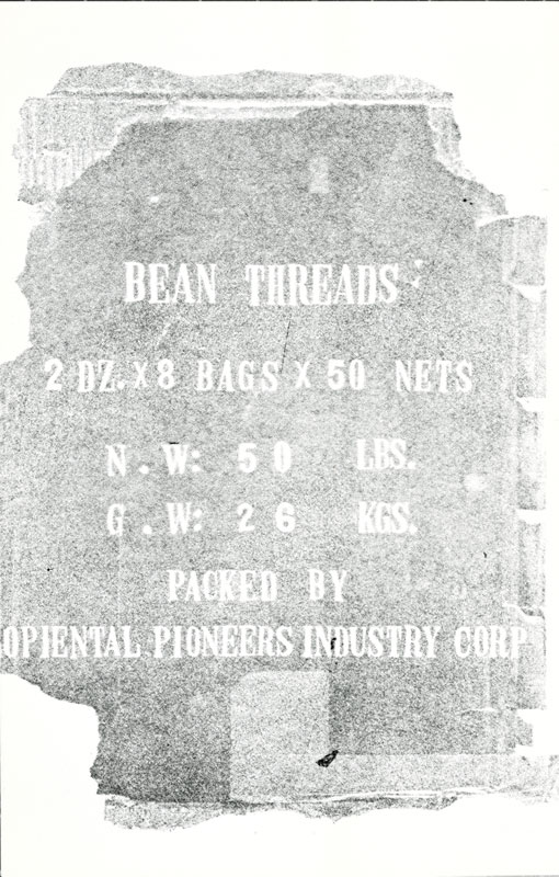
Alison Knowles (American, born in 1933), Bean Threads (for Henri Chiarucci), from the "Image Bank Postcard Show" by Michael Morris and Vincent Trasov, c. 1977. Ink on paper. Courtesy of the Ute & Bill Bowes Art & Architecture Library, Stanford Libraries
This postcard was Alison Knowles’s contribution to a 1977 postcard “show” by the Vancouver Image Bank, a Canadian collective that circumvented traditional exhibition venues by distributing artworks by mail. Containing small-scale images by forty-nine contemporary artists in a single box and sold in an edition of 750, the Image Bank Postcard Show was designed to unfold over the amorphous terrain of the postal service. Knowles, who makes performances, event scores, and publications focused on the musical or poetic potential of daily rituals, created a postcard dedicated to the physicist Henri Chiarucci, a member of the experimental Musical Research Group. Knowles used beans throughout her practice to represent “a world culture of sustenance,” and this postcard features a faded image of a bag of bean threads, a kind of noodle made from mung beans. In combining an image of the bean package, seen from a flattened perspective, with the familiar shape of the postcard, Knowles provokes viewers to contemplate the surrealist capacities of overlooked items, from the kitchen to the mailbox.
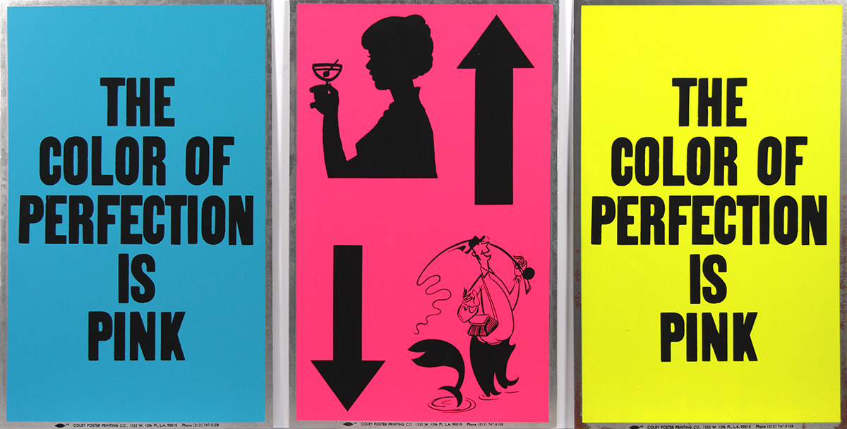
Allen Ruppersberg (American, born in 1944), Poster Objects (The Color of Perfection is Pink), 1988. Screenprints on aluminum. Gift of the Marmor Foundation (Drs. Michael and Jane Marmor) from the collection of Drs. Judd and Katherine Marmor.
Allen Ruppersberg (American, born in 1944), Poster Objects (The Color of Perfection is Pink), 1988. Screenprints on aluminum. Gift of the Marmor Foundation (Drs. Michael and Jane Marmor) from the collection of Drs. Judd and Katherine Marmor, 2006.112.a-c
Throughout much of his career, Allen Ruppersberg has produced works in collaboration with the Colby Poster Printing Company, a Los Angeles business that produced distinctive, brightly colored notices typically used to promote concerts, sales, and other local events. Established as a family-run business in 1948, Colby allowed clients to choose from 150 typefaces, which were often juxtaposed in eye-catching combinations. Its posters frequently appeared on utility poles, trees, and fences throughout the city, becoming a common element of the urban landscape. Before Colby closed in December 2012, company president Glenn Hinman, the grandson of founder Herbert Lee Colby, estimated that about 15 percent of its orders came from fine artists, including Ruppersberg, Sam Durant, Eve Fowler, Daniel Joseph Martinez, and Alexis Smith.
This multipart work from Ruppersberg’s Poster Object series is printed on thin aluminum rectangles reminiscent of parking or street signs, adding a feeling of durability to the typical poster template. The three metal placards combine text and imagery seemingly at random; devoid of context or clear purpose, phrases such as “the color of perfection is pink” and a clip-art image of a cheery fisherman are rendered surreal. They destabilize the idea that posters are intended to advertise a product or clearly relay information, provoking viewers to consider the absurdist potential of slogans and symbols.
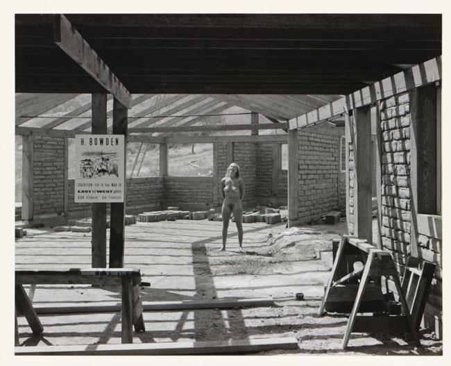
Harry Bowden (American, 1907–1965), Nude and Bowden Poster, Construction Site, 1942-1965. Gelatin silver print. Gift of Charles Campbell, 1979.113.35
Harry Bowden (American, 1907–1965), Poster behind Grating, 1942-1965. Gelatin silver print. Gift of Charles Campbell, 1979.113.18
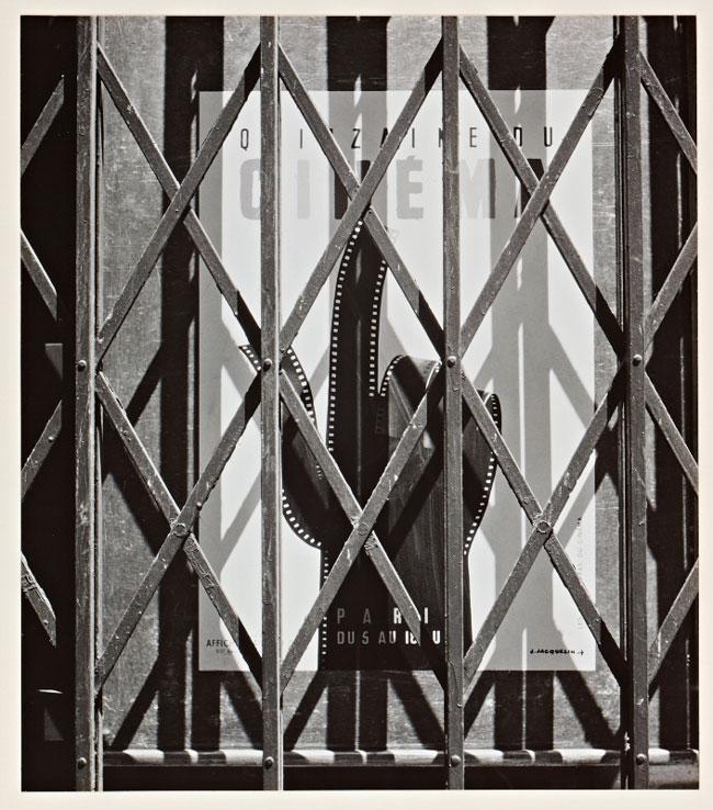
Though Harry Bowden primarily considered himself a painter, today he is equally known for his arresting black-and-white photographs. He often captured female nudes in sublime California landscapes, but Nude and Bowden Poster pictures a joyous model in a more urban backdrop: a gritty construction site, with a crisp poster for Bowden’s exhibition at the East and West Gallery in San Francisco placed incongruously in the middle distance. In the second photograph, a French film poster is enclosed behind an accordion grate, producing a layered play of line and shadow. The unusual surroundings in these scenes subvert the broadsides’ usual legibility, emphasizing their status as props within a photographic context of Bowden’s own making.
Beginning in 1988, the art collectors Peter and Eileen Norton commissioned artists to create editioned works as Christmas gifts for their friends and art world contacts. Unlike the average yuletide greeting, the editions, issued through 2018, demanded some form of participation or contained prickly, thought-provoking content, recasting the mild template of the yearly holiday card as a vehicle for artistic experimentation. The 1997 Christmas project is an intricate pop-up book designed by Kara Walker, who uses the genteel form of silhouettes to convey dreamlike, horrific tales of slavery. The subtitle of the book is “a curious interpretation of the wit of a negress in troubled times, with illustrations,” and it tells the story of an unnamed woman who travels across the sea in search of emancipation. Viewers participate in the unfolding of the story through tactile elements; on one particularly evocative page, the main character “births” quintuplets when a tab is pulled.
The story and imagery of Freedom: A Fable likely reference The Voyage of the Sable Venus from Angola to the West Indies (c. 1800), an etching by the British artist Thomas Stothard. Stothard’s image illustrated Isaac Teale’s 1793 poem “The Sable Venus: An Ode,” both of which are included within the pages of Bryan Edwards’s 1801 book The History, Civil and Commercial, of the British Colonies in the West Indies. Teale’s poem recounts the journey of a Black “Venus” across the Atlantic to the Americas without reference to the terrors of the Middle Passage; instead, the white narrator describes his sexual desire for “beauteous” Black women in racist and misogynistic terms. As seen in an engraving in the Cantor collection by William Grainger, created after Stothard’s original print, the illustration paired with this poem pictures a Black goddess on a scallop shell, a composition inspired by Sandro Botticelli’s Birth of Venus (c. 1484–86). Though Stothard’s goddess is the product of white supremacist and colonialist thinking, subsequent artists, writers, and scholars have reclaimed her as a figure of Black empowerment and beauty, as in Margaret Burroughs’s 1957 linocut Black Venus. Throughout Walker’s body of work, she explores the possibilities—and limits—of repurposing imagery associated with racist caricatures to convey more expansive, liberatory narratives.
The 1996 Peter Norton Family Christmas Project was a fourth, “more universal” edition of Oblique Strategies, a set of cards originally created by the musician Brian Eno and the artist Peter Schmidt in 1975. Each card presents a strategy for avoiding creative blockages, such as “work at a different speed,” “ask your body,” or “use an old idea.” With Oblique Strategies, Eno and Schmidt reimagined a familiar deck of playing cards as catalysts of creativity. Through the chance selection of abstract instructions on a card, the user could spark fresh thoughts, engage different senses, and evade artistic or writerly ruts. Peter Norton persuaded Eno to collaborate on this fresh version of the cards, and the artist Pae White updated their graphic design with enticing colors and created a sleek, biomorphic case for the set. As befitting the “more universal” title of this edition, the one hundred cards include translations into Hindi, Mandarin, Spanish, Russian, and Arabic.
You've reached the end of the Everyday Things Made Anew section.
Continue ahead to look at the next section of this exhibition or click the button below to explore a different section.
In considering the objects that surround us, sorting through keepsakes and rubbish, the decorative and the documentary, we make determinations similar to those of curators and archivists. But these judgments are not binary, and what may be considered communicative and informational one day might be valued for its aesthetic or nostalgic qualities the next. In his introduction to Collecting Printed Ephemera (1988), the scholar, collector, and “ephemerist” Maurice Rickards attempted to define the term, but quickly ran into exceptions to all of his rules. He finally concluded, “In these and many other grey areas the answer must be left to the individual. There is no hard and fast list of officially sanctioned categories.” The same may be said of all the works in this exhibition, which chart the fluidity of artistic practice and the ways in which this fluidity confounds the hierarchical sorting mechanisms that still persist within collecting institutions and the field of art history. In their engagement with everyday formats, from the broadsheet to the deck of cards, they invite us to consider the design, formal innovations, and materiality of ostensibly marginal objects with fresh attention.
You've reached the end of this exhibition.
Click the button below to go back to the top menu.